Museu do Amanhã re-brand
Branding
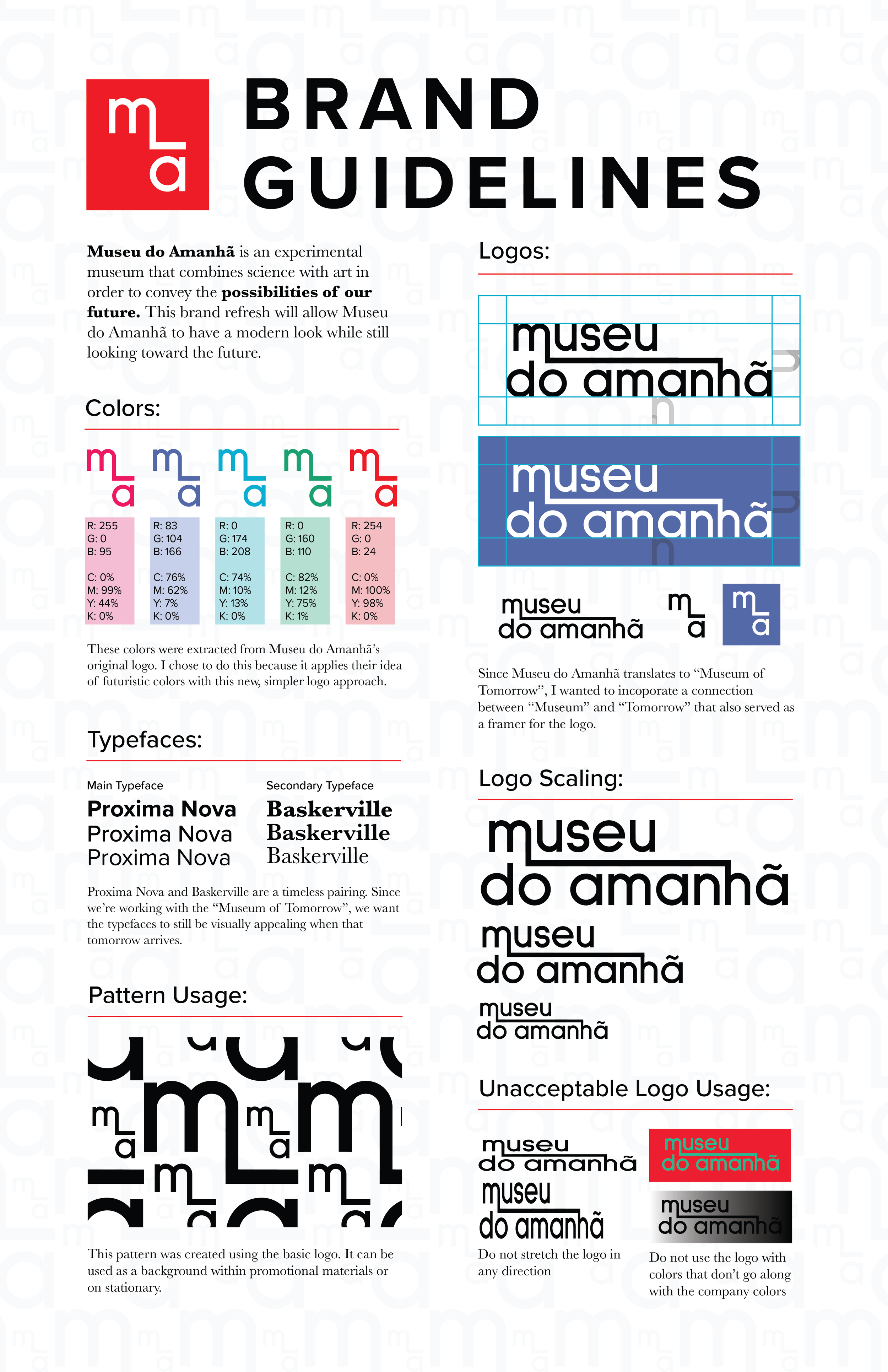
The Problem: Museu do Amanhã means “Museum of Tomorrow.” For this project, I wanted to create something that represented this futuristic museum accurately. The original logo features a burst of a rainbow of colors. I wanted to create something that more directly says “Museum of Tomorrow.”
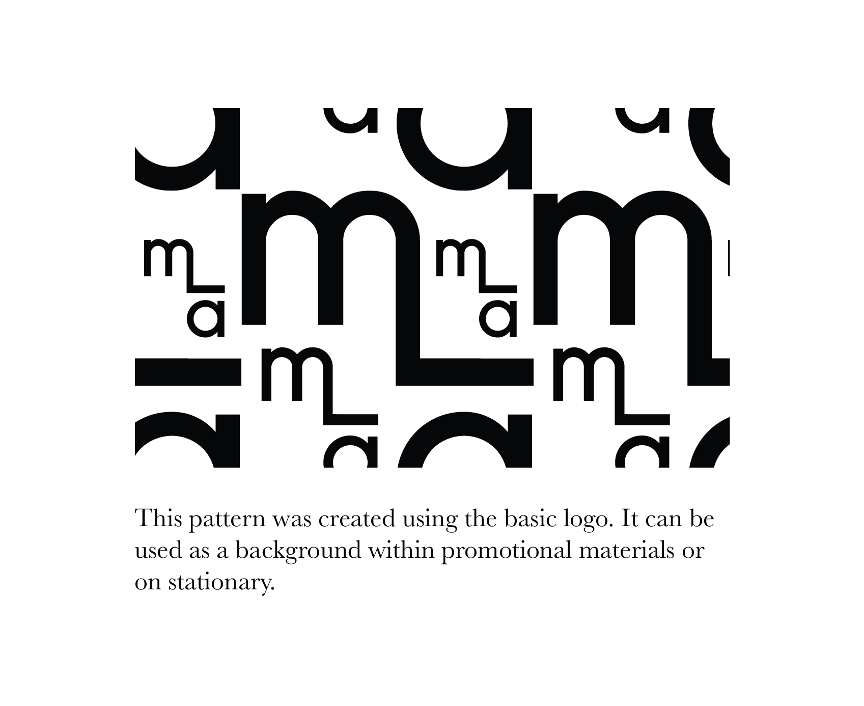
The Idea: I began doing sketches and tried to include a similar visual to the original. This then evolved into a connection between the M in “Museu” and the H “Amanhã,” implying that today, we have a direct connection to tomorrow.
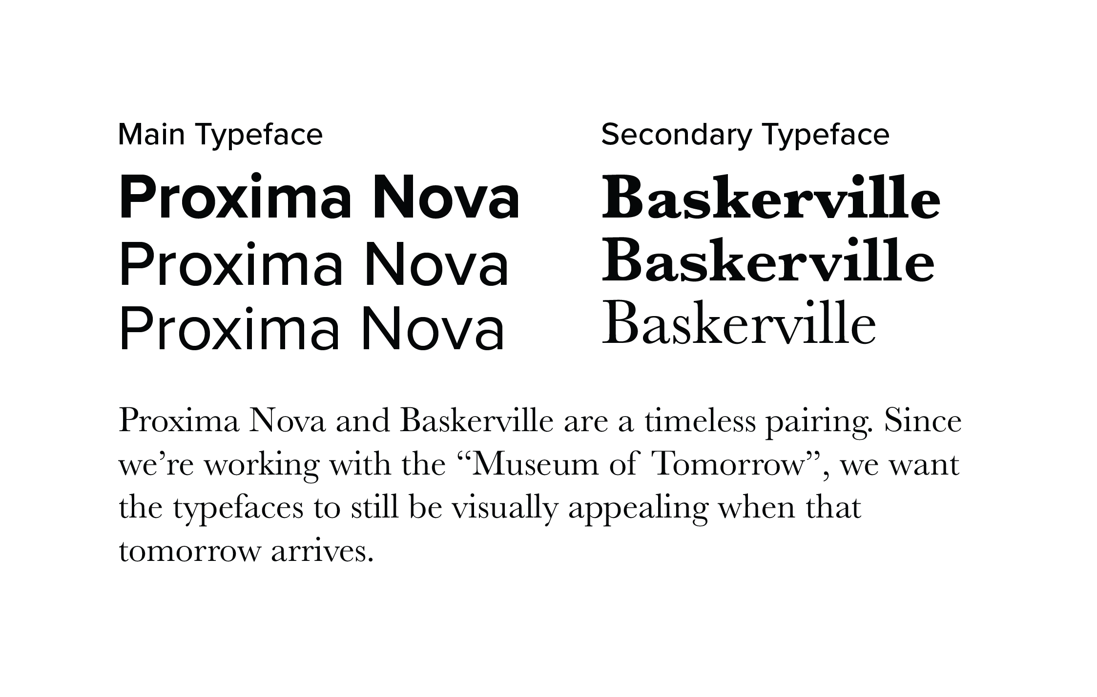
The Solution: I developed the connecting idea and extracted colors from their original logo. I did that so I can still maintain a connection with their current identity. The main typeface that I used was Proxima Nova. While I chose this font because of its timelessness, I also chose it because it directly translates to “next new” in Portuguese, which embodies the nature of the museum.
Museu do Amanhã’s current branding
My Re-brand
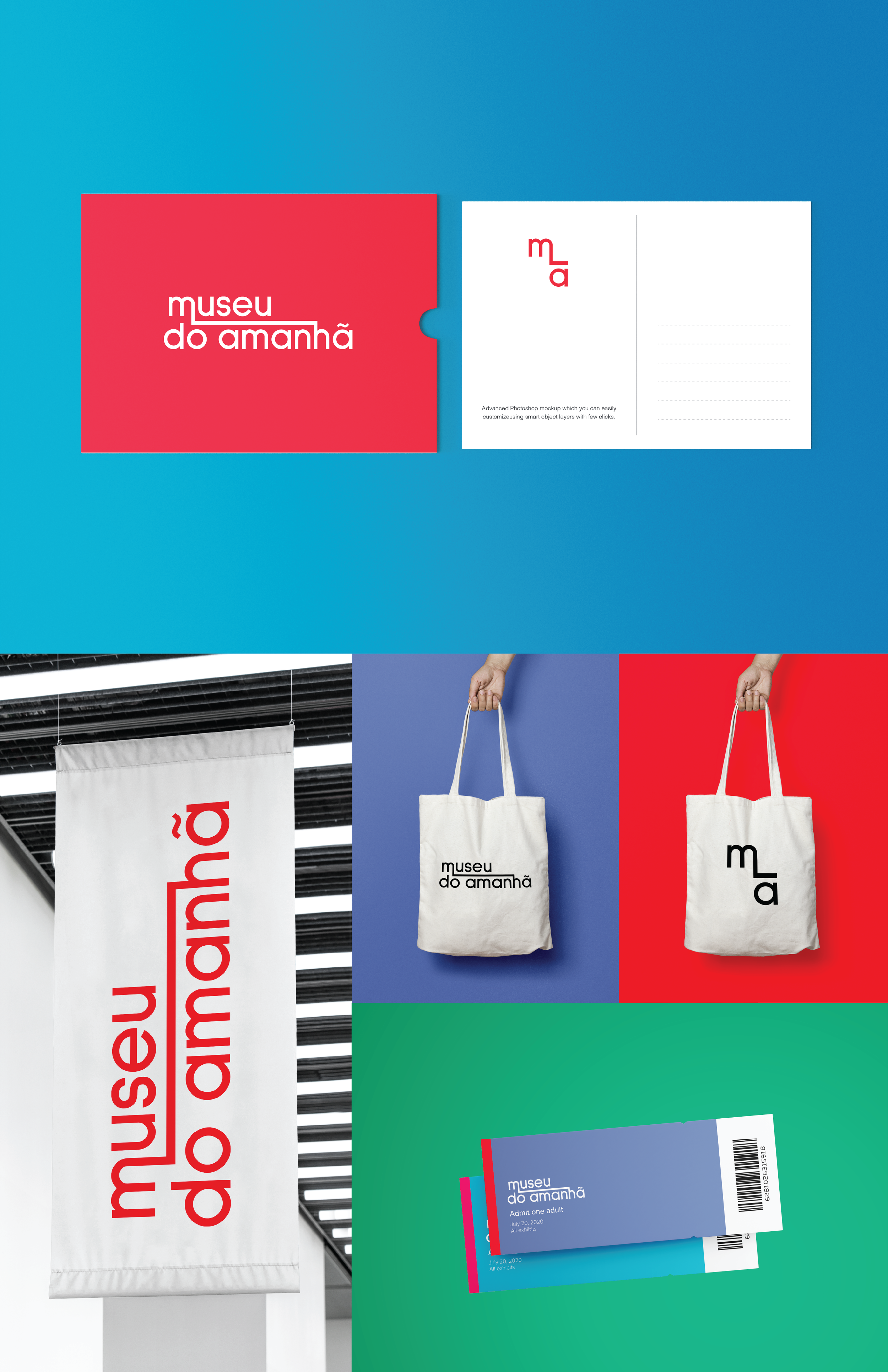
Color and type Applications
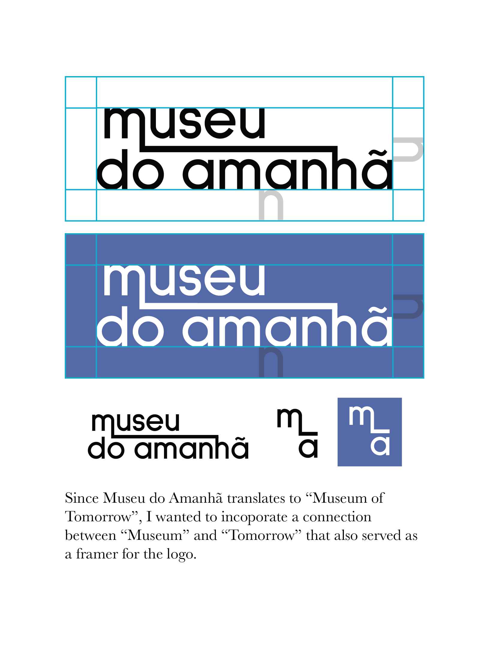
Logo Applications
Presentation Posters
